 .
.


Next up, the "Arts and Entertainment" section
Food and Dining
Shopping
City life
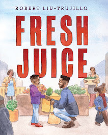
And the cover lawd, I thought "no problem" at first. But the more I drew , the more I struggled with what to do. I know some of you artists get that sometimes right? Im sure a 100 artists could do an ill cover, but hey this is mine and I had fun doing it. Especially after I changed and moved stuff around 10 times!
On the imagery, For this I wanted to show "Children". SF has one of the lower rates of kids due to the super over priced housing, but yo there are still hella kids there. My mother and all my aunts and uncles went from k-12 there. I wanted to show some cats protesting and playing music because i think SF comes from a very diverse array of people who all bring their own flavor. I want to give a shout out to my art director Brooke Robertson for backing up my ideas even if some were way off what she had in mind. And for giving good feedback to improve them.
READ The SFBG issue ONLINE: You'll get a sense of why this newspaper has been and will continue to throw some rocks here in the Bay. Here's a couple of screen shots, will post real paper when I actually get one.


2 comments:
I love seeing the whole process!
the sketches, the comps the redo's the finishes. I always think my sketches look better than the comps finals
Right on homie, yeah I like my sketches better sometimes too. Every now and then I try to paint directly on the sketch if its my own project.
Post a Comment